The Digital GP website review
Reviewing The Digital GP's website from a user experience standpoint
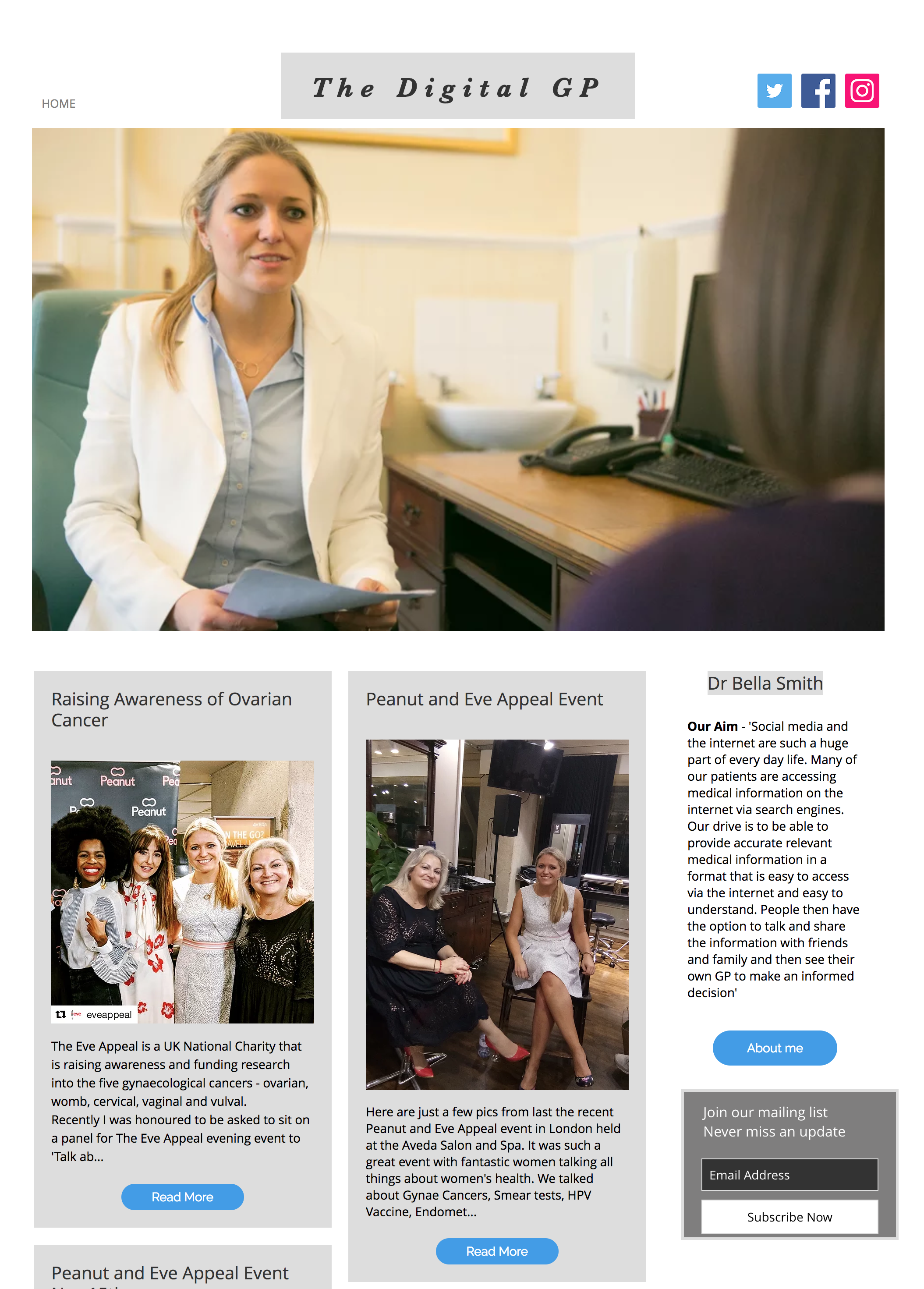
A screenshot of The Digital GP's homepage, as it was before the review.
January 2018
MarketingWebsite design
The Digital GP
Some background
The Digital GP is an online presence aimed at providing peace of mind to those who need it and insightful information from an experienced doctor through podcasts and articles. She had a put together a website on Wix and asked if I would look at it to determine whether any layout, visual design or usability issues could be identified and resolved.
The brief
Review The Digital GP website to find any issues that could affect people visiting the site for information. Once they have been identified, solve the issues.
The process
I started by taking screenshots of every page on the site, which turned out to be a grand total of two, so that I could quickly make comments on what worked well and what could be done better as a quick fix.
Let's start with the pros:
- Immediately putting a face to the name - site visitors are interested in who this is
- The blog post layout is great: clear and easy to read
- The site already has good, prominent and obvious calls to action
- The social media links are obvious and don't create confusion within the site content
And the cons:
- The navigation menu is hidden by default and only displays on hover. This means that there's no immedite view of how deep the site is and mobile users are automatically at a disadvantage as 'hover' doesn't exist for them.
- Who identity/information on The Digital GP is one of the pieces of information that visitors will want to know immediately. Being on the right hides it as people in Europe and the UK instinctively look left to right. It should be moved to the left.
- It took me a while to figure out that these are podcasts - I immediately thought that they were more blog posts but couldn't understand how they fit in...they need a label.
- There are no clear 'next steps' for those visiting the site...some signposting is needed.
- The footer information has nothing to do with the site - the copyright iteself is years ahead! Needs to be made relevant.
- Although the image is great, there's no accompanying information with it. Some context is needed.
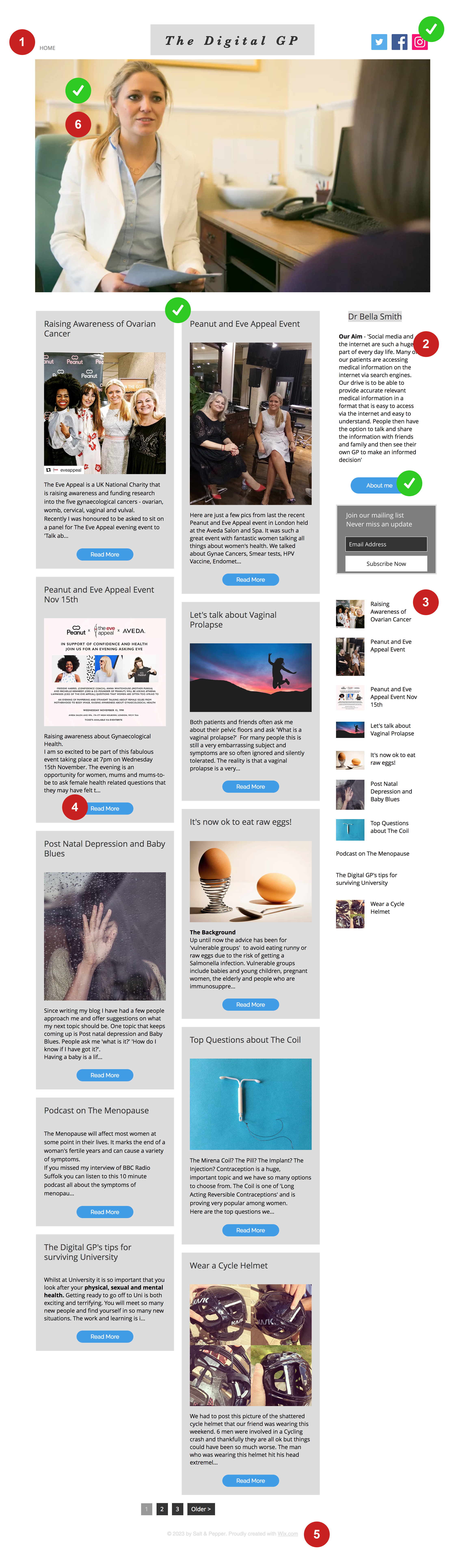
A screenshot of the home page with comment numbers on
More to come...