Allstar Uhlmann shop signage
Re-creating, updating and tweaking the Allstar-Uhlmann logo for new shops
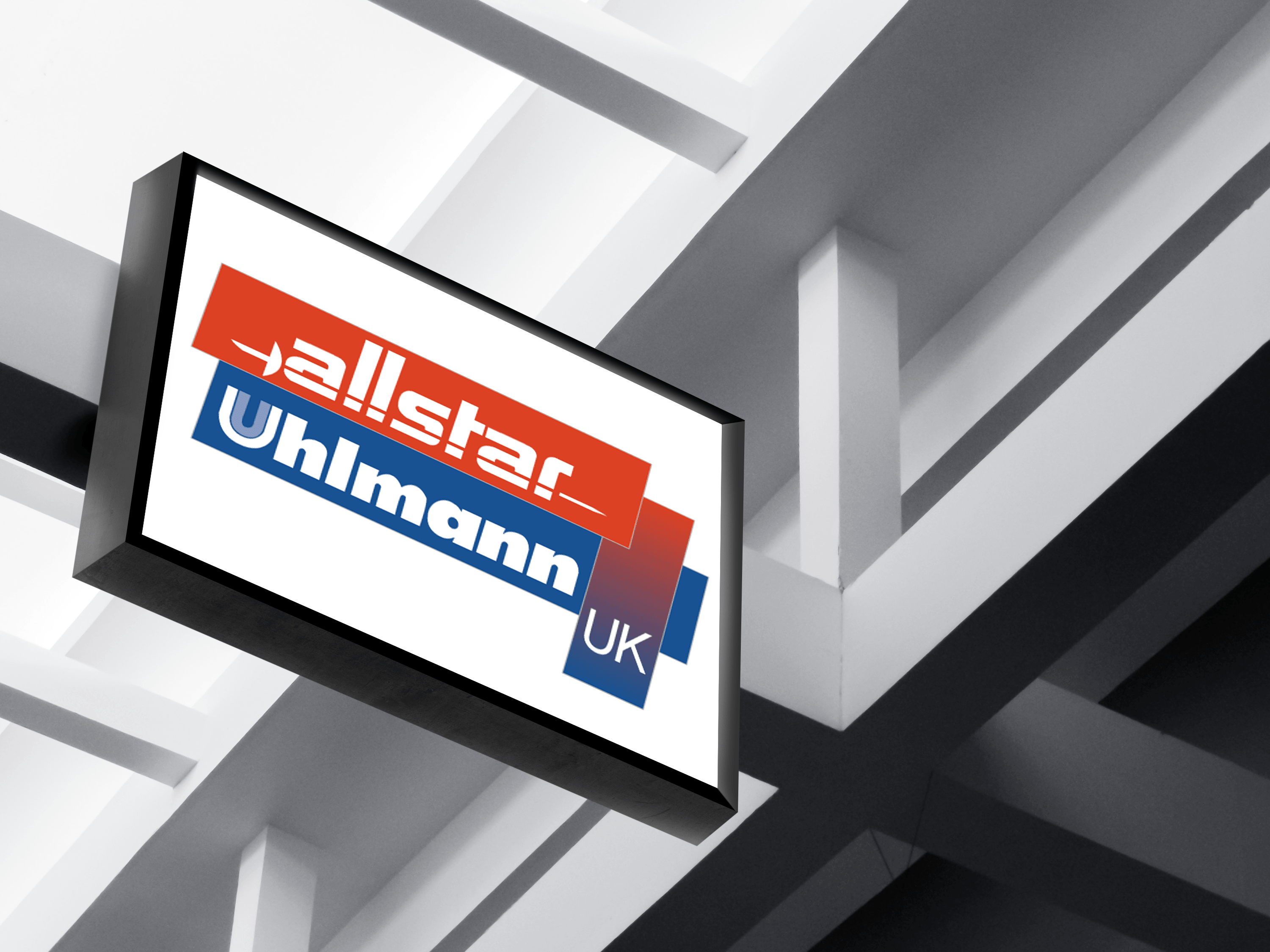
The narrow version of the new Allstar Uhlmann UK Logo mocked up on a shop sign
June 2016
LogosMarketing
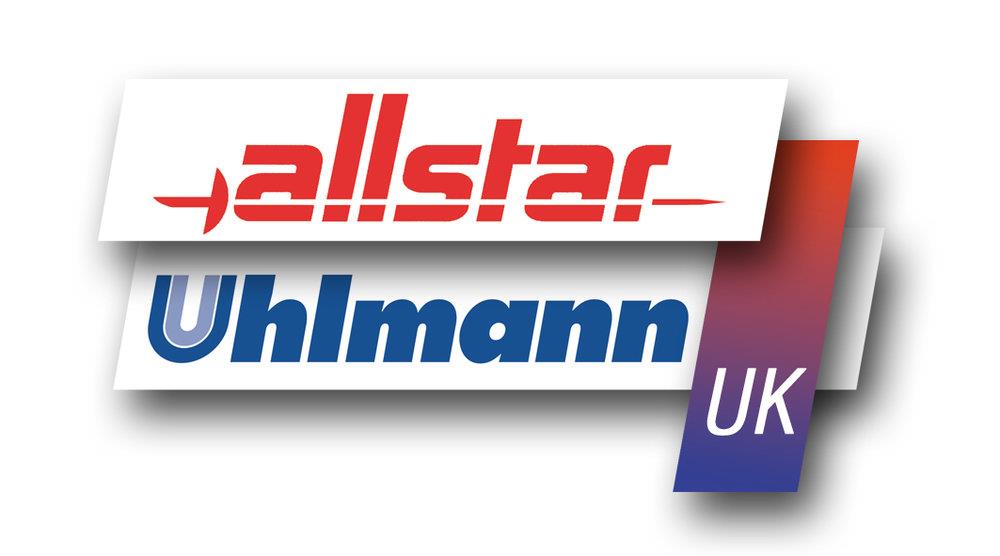
Allstar Uhlmann UK
Some background
Allstar-Uhlmann changed shop location and needed to create new signs for attract customers - however they only had images and PDFs of the logo (which were unsuitable for scaling up in size or fitting on to new sign boards). I was asked if to could re-create it with some tweaks for improvements as well as putting the logo into a sign design.
The brief
Tweak the current logo to make it cleaner, bolder and more engaging so that when customers are driving by and looking for the shop it stands out and catches their eye.
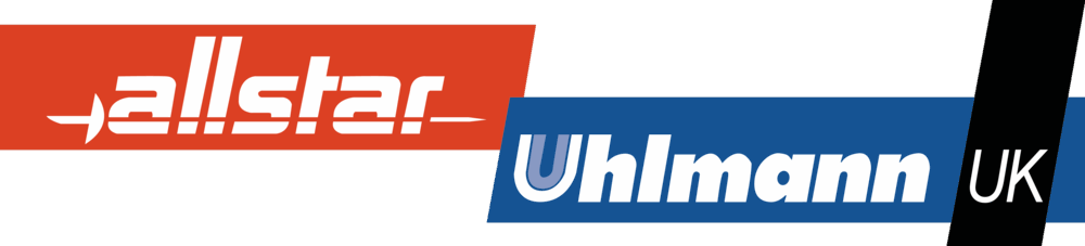
The old Allstar Uhlmann UK Logo
The process
The shop owner wanted to use this opportunity to modernise the logo without looking for a complete re-design - just a few tweaks. He wanted it to be:
- neater
- bolder
- more modern
The end users are shop customers and passers-by (advertising). Working iteratively with the shop owner to create a design he is happy with.
2016 has been the year of flat design and saw many brands (eBay, Google, Microsoft and Netflix to name just a few) re-working their image along 2D lines. There has also been a shift towards wider logos, circles using the magic grid and stepped colour changes (instead of gradients) - all of which are great for inspiration.
The old (left) and new (right) eBay logos
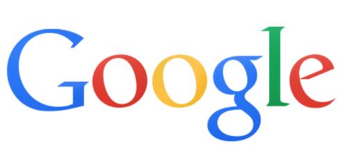
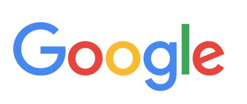
The old (left) and new (right) Google logos


The old (left) and new (right) Microsoft logos


The old (left) and new (right) Netflix logos
However as I wasn't looking at a full blown re-design and that the flat design options ticked more of the boxes, I chose to consider the others but only fully explore the flat options.
The outcome
The result of the work saw the following improvements:
- a wider logo
- no gradients
- a secondary version
- signs and artwork that can be easily created and modified
- the company now has an Adobe AI file that can be used for future updates
The result of the work is a logo that is more engaging, beautiful and obvious from the road side.
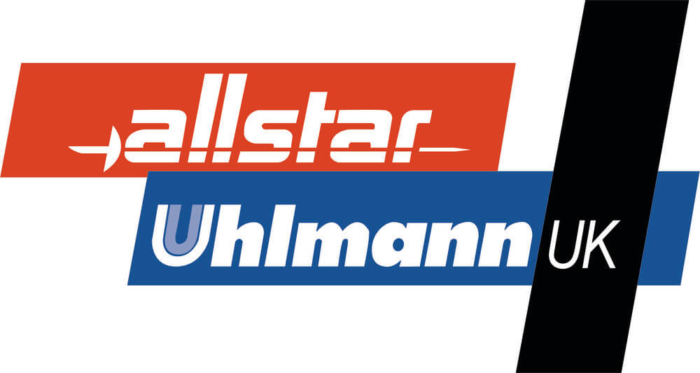
Left: new logo, default. Right: new logo, alternate
The designs below are the artwork that was created specifically for the signs in the shop:
Shop sign, large board
Shop sign, small board
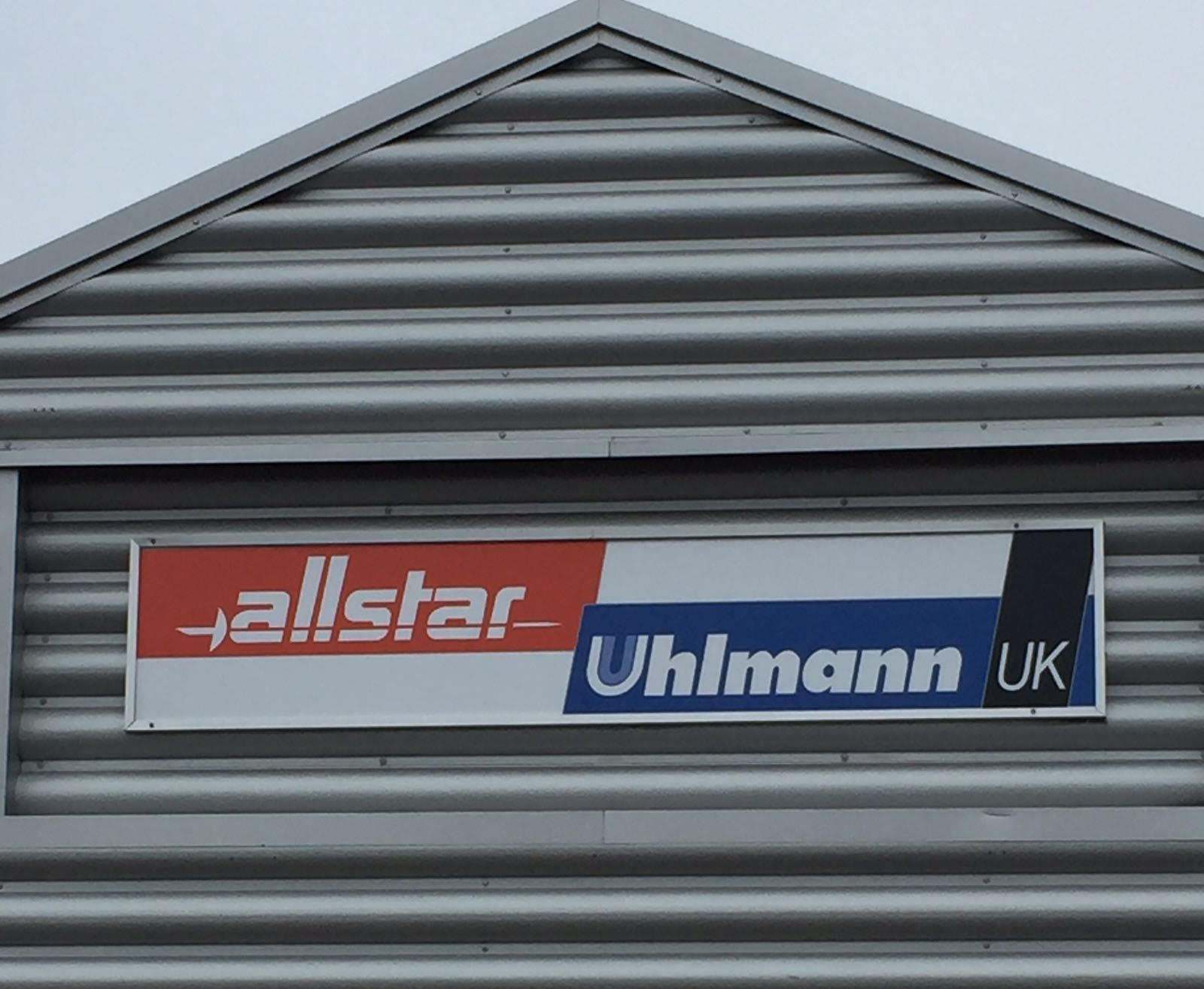
The wide version of the new Allstar Uhlmann UK Logo on the actual sign, viewed from the road