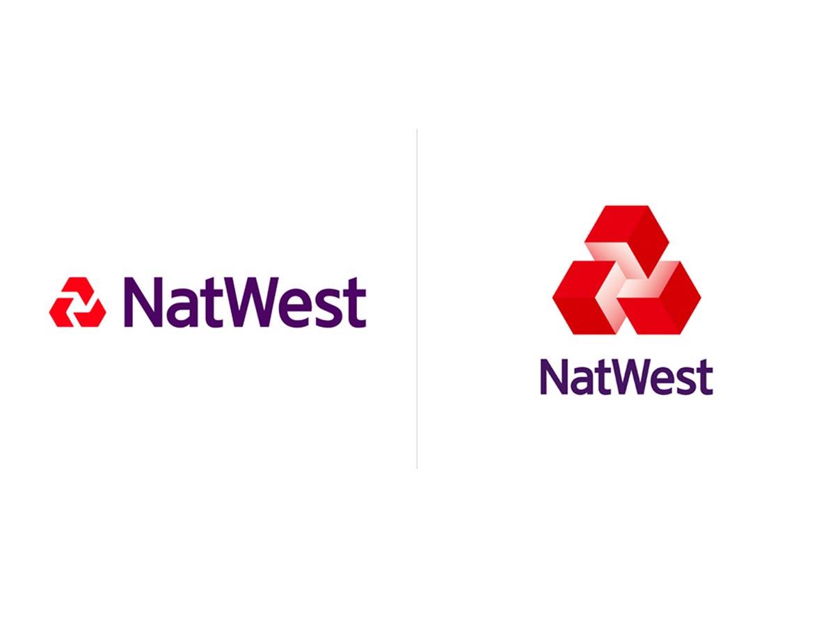
Who says that logos have to be a specific reference to what the business does? Or that they have to be flat, like recent trends? Natwest has made a slightly retro move back to it's original logo from the 60's, with a modern twist.
I found this on Under Consideration, a website that brings brand changes and corporate updates to the world. I like it.
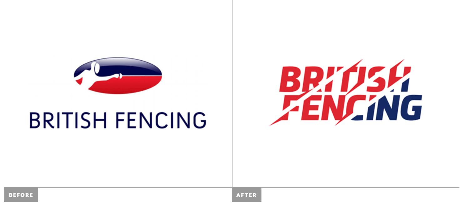
While I'm on it, they have also reported a newly created identity for British Fencingwhich I think is pretty impressive as an overall package. I'm not the biggest fan of the logo on it's own, but it works really well as part of a larger piece (which is what a logo is meant to be anyway).