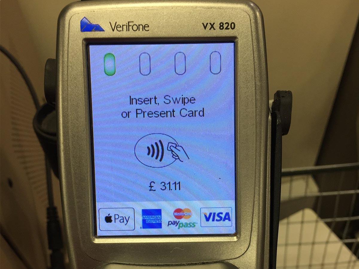
We know what happens here don't we? You want to pay for your shopping, so you get out your contactless card (or iPhone), tap and be on your merry way.
Think again.
The limit for paying on a contactless card is £30 and for some reason the scenario where your total is over £30 decided to be ignored - so we still see the icon when it no longer applies. Essentially the UXer lost the tug of war - very frustrating! Especially when you'd get a big reward for a small amount of effort. All for the sake of a simple solution where the machine has a small line of code that says:
"If the total is more than £30, don't show the contactless icon" .