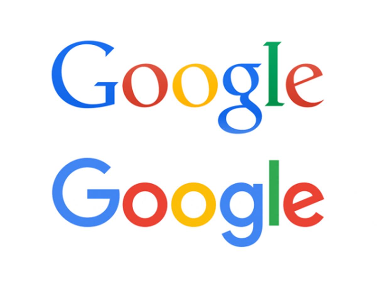
Google unveiled its new logo this week, to the surprise of many. The worlds response? Uninspired.
Their new logo is too raw and childish, it feels completely unfinished and, most importantly, has lost its history. The typeface of the old logo was a clear touch point for people around the world, and not just users. It was completely distinguishable and put across everything they have achieved in the last 17 years - a company that leads revolution with the creation of an product that works SO much better than anyone else, followed by Google maps and Android but to name a few highlights.
For example, Coca-Cola would never dream of ditching a brand that has become so iconic around the world.
One could argue that this redevelopment is a clear example of that, but I believe they have completely changed identity and the outward foundation of everything they have achieved.
